

Back to futurelearn
Topic 5E - Estimating Emissions During the COVID-19 Pandemic
Featured Images and Example Data
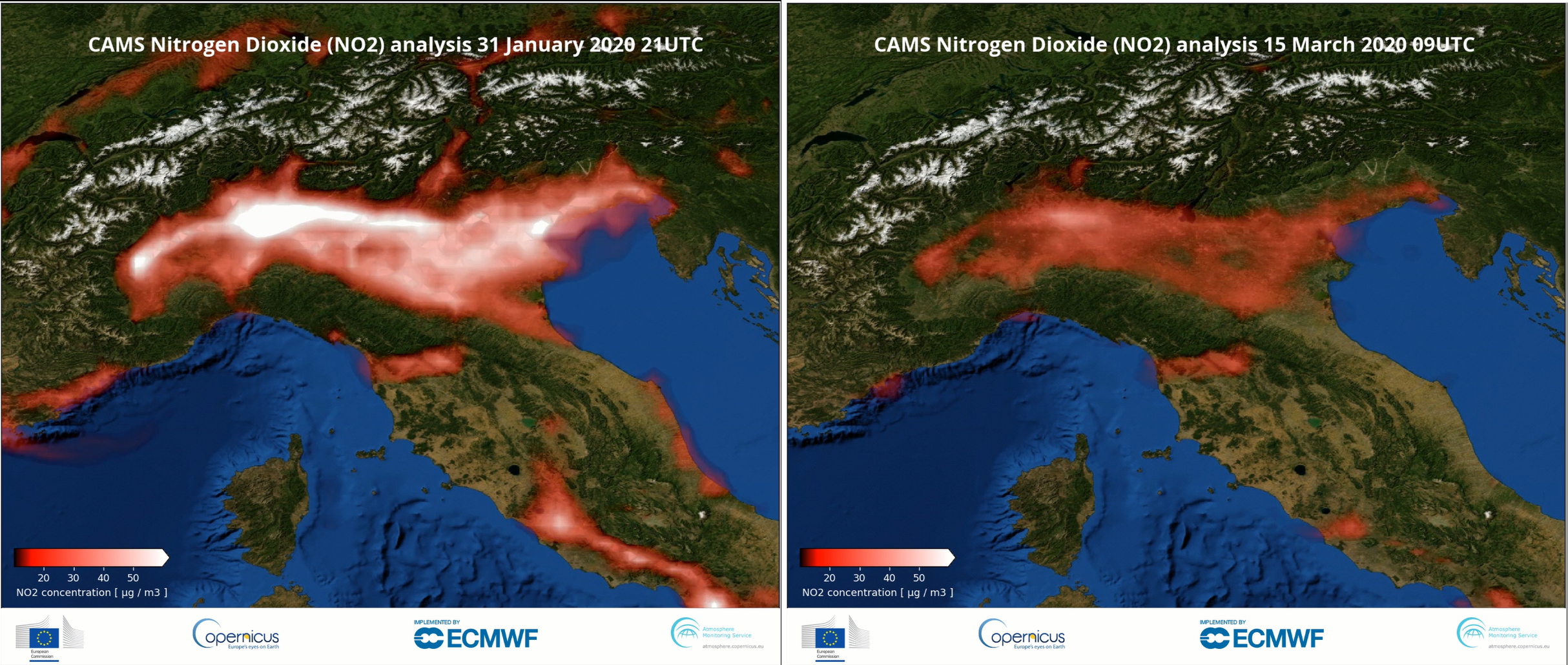
NO2 concentrations 31 Jan & 15 March 2020 for Northern Italy
These two images show Nitrogen Dioxide (NO2) concentrations for 31 January 2020 and 15 March 2020 over Northern Italy
©
Copernicus Atmosphere Monitoring Service
Source Link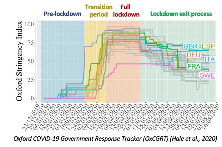
COVID-19 gov response tracker
This graph shows the COVID-19 government response for a number of European countries
©
Hale et al, 2020
Source Link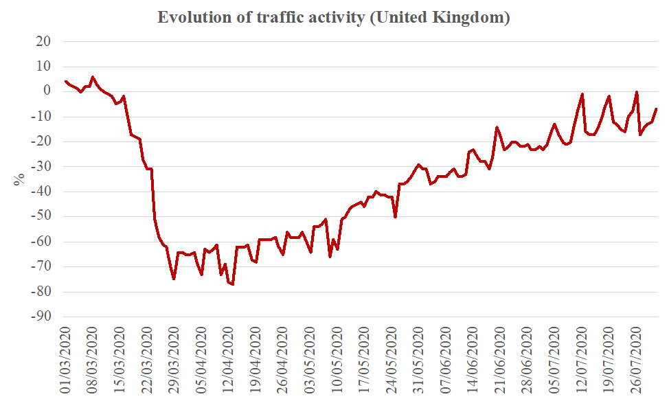
Evolution of traffic (UK)
This graph shows the evolution of traffic activity for the UK during the COVID-19 pandemic
©
Marc Guevara
Source Link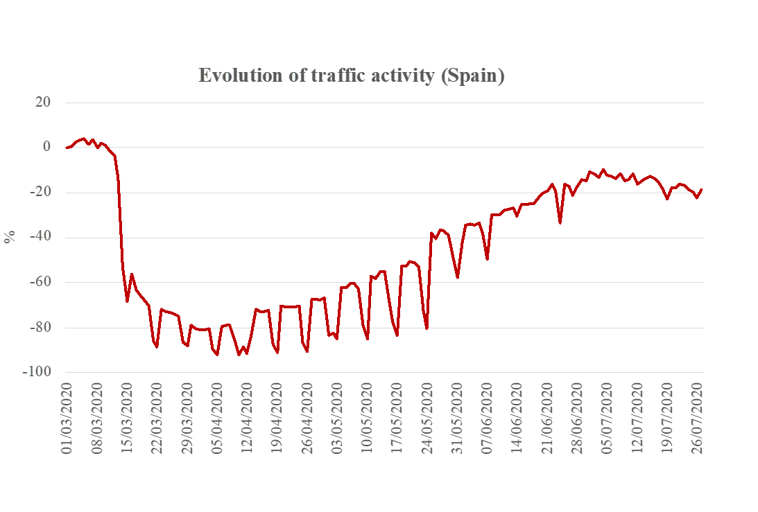
Evolution of traffic (Spain)
This graph shows the evolution of traffic activity in Spain during the COVID-19 pandemic
©
Marc Guevara
Source Link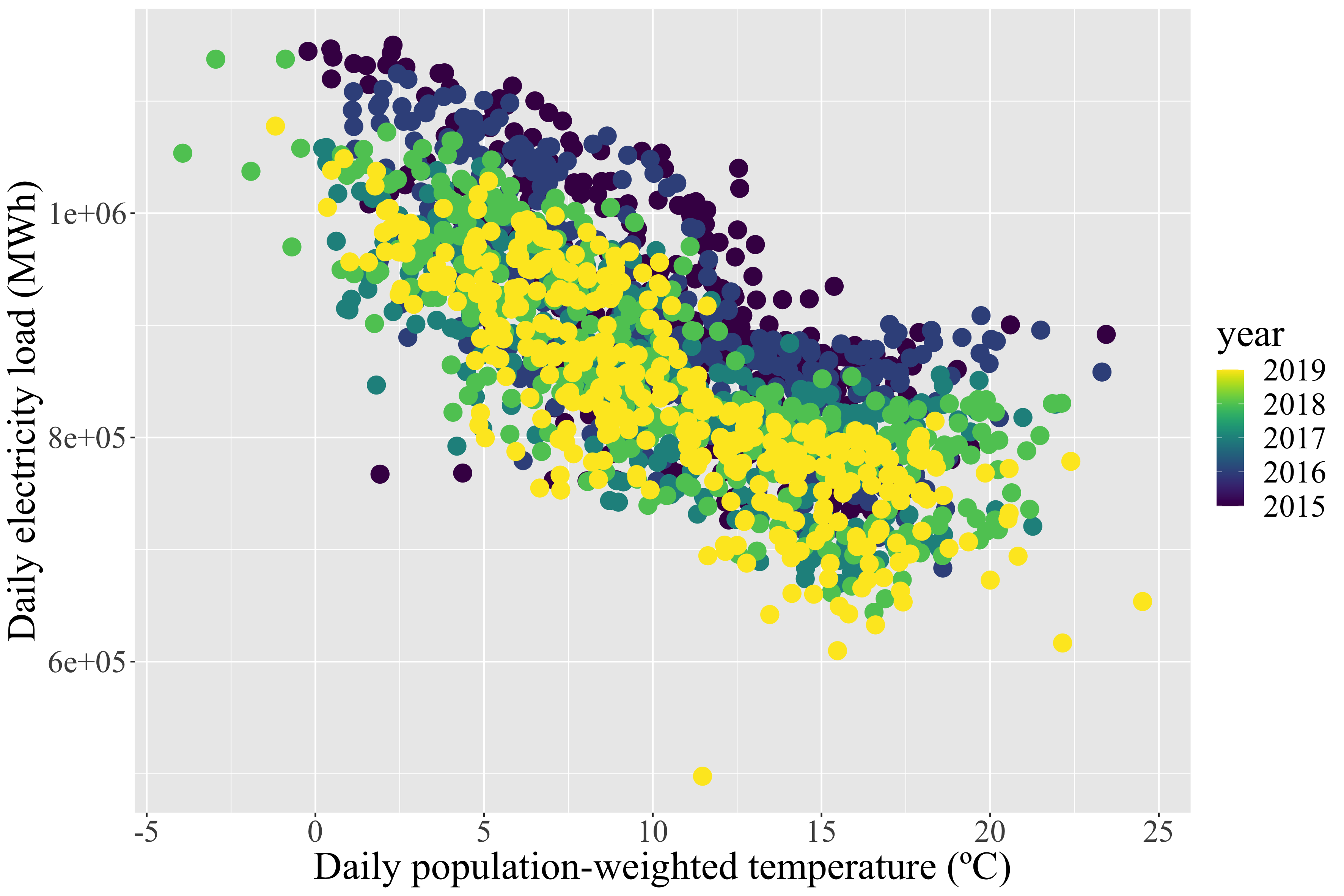
Electricity load to population weighted temperature 2015-2019 (UK)
This graph shows daily population-weighted temperature in the UK from 2015 - 2019 compared to daily electricity load
©
Marc Guevara
Source Link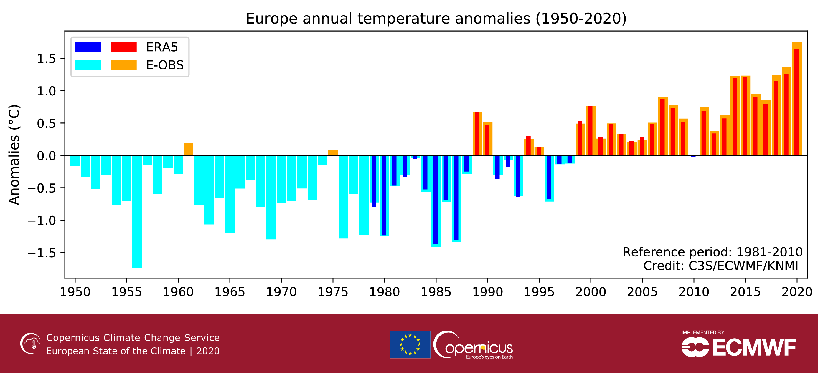
European Annual Temperature Anomalies
This graph shows European average temperature anomalies from 1950-2020 from ERA5 and E-OBS reanalysis data
©
Copernicus Climate Change Service
Source Link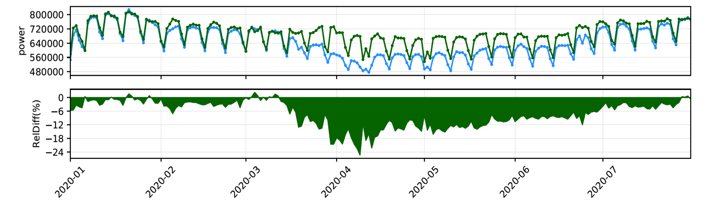
Real vs business as usual electricity consumption (Spain)
The top graph shows the real (blue line) vs business as usual scenario (green line) for electricity consumption in Spain during the COVID-19 pandemic, and the bottom graph is the difference
©
Marc Guevara
Source Link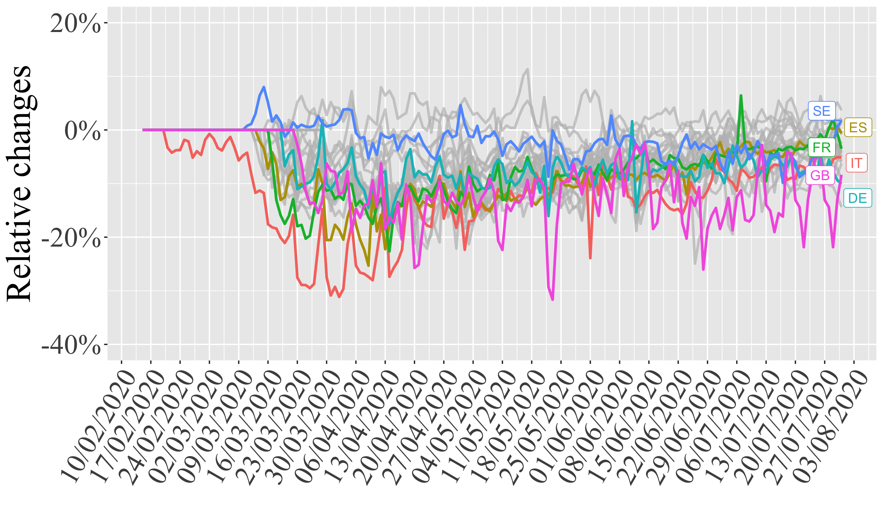
Energy Industries
This graph shows the relative changes in energy usage for a number of different European countries during the COVID-19 pandemic in 2020
©
Marc Guevara
Source Link
NOx Emissions
EU NOx average weekly emissions during the COVID-19 pandemic in tonnes separated by industry
©
Copernicus/ECMWF/CAMS/Barcelona Supercomputing Center
Source Link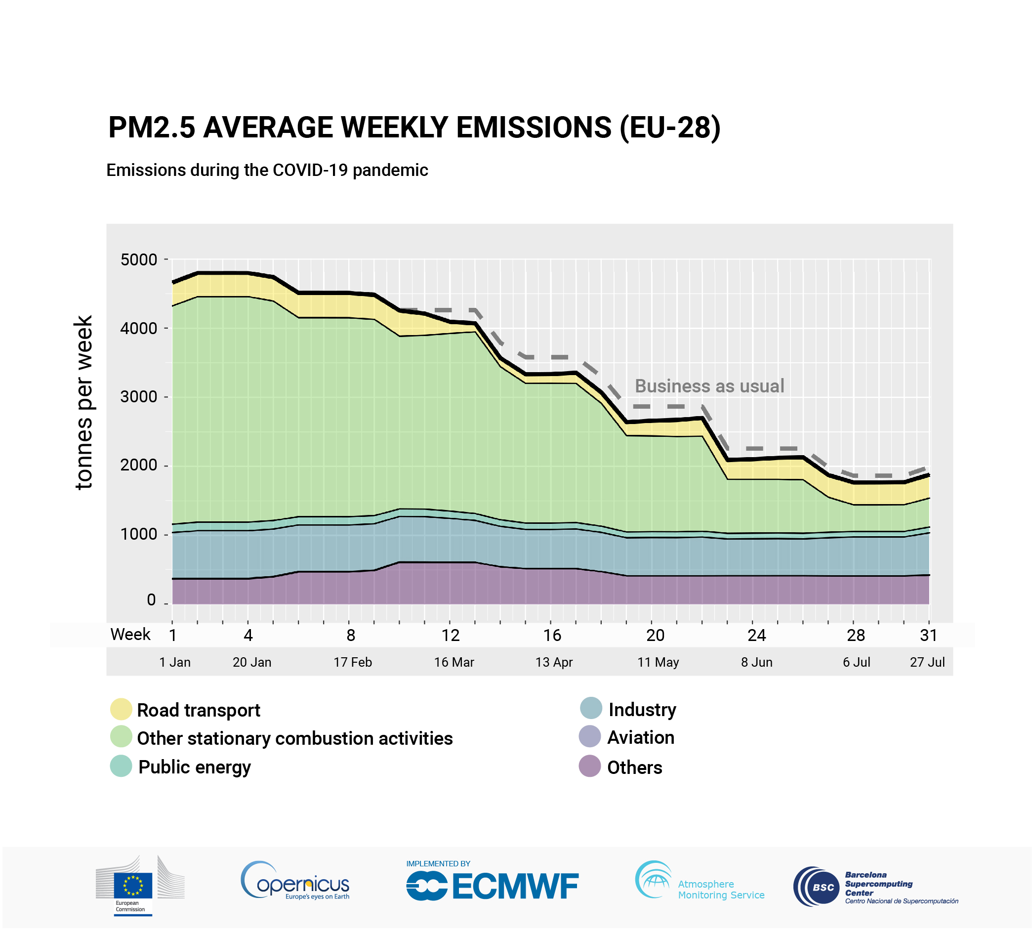
PM.25 emissions
EU PM2.5 emissions during the COVID-19 pandemic in tonnes, separated by industry
©
Copernicus/ECMWF/CAMS/Barcelona Supercomputing Center
Source LinkFeatured Video and Animations
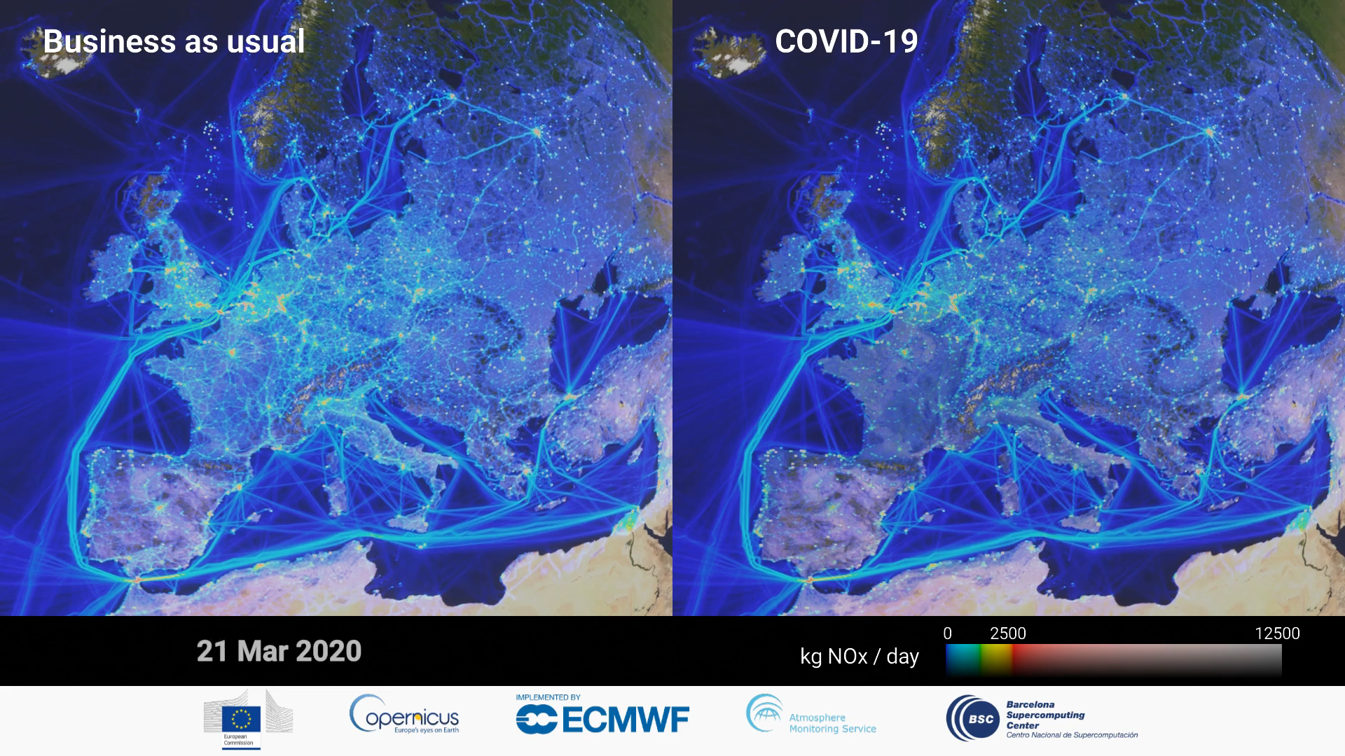
NOx emission decline in 2020 as compared to the business-as-usual scenario
Animation of the absolute cumulative NOx emission decline in 2020 as compared to the business-as-usual scenario, still 10 April 2020. Applying artificial intelligence, the study provides a daily sectoral and spatial emissions breakdown as well as information on country-level contributions and different pollutants..
©
Copernicus Atmosphere Monitoring Service/ECMWF/BSC
Source Link
Sign up to our newsletter to get updates from Imperative MOOCs
Thank you! Your submission has been received!
Oops! Something went wrong while submitting the form.